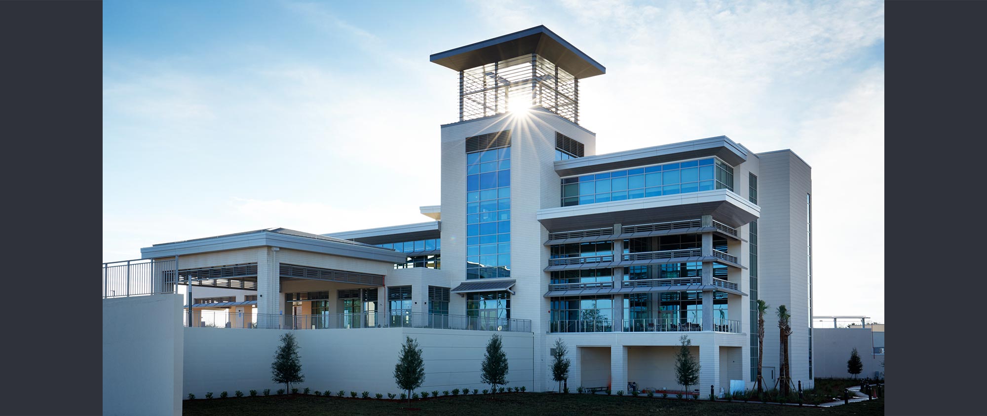
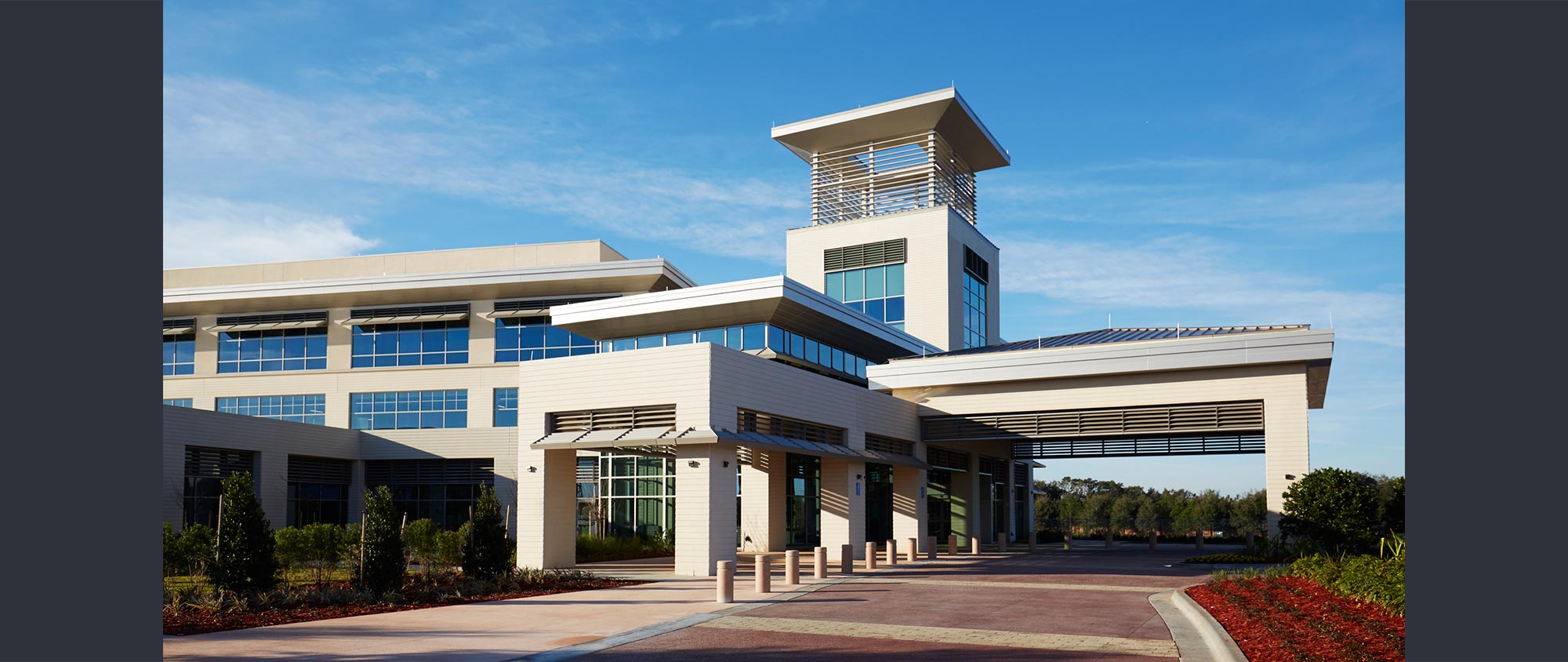
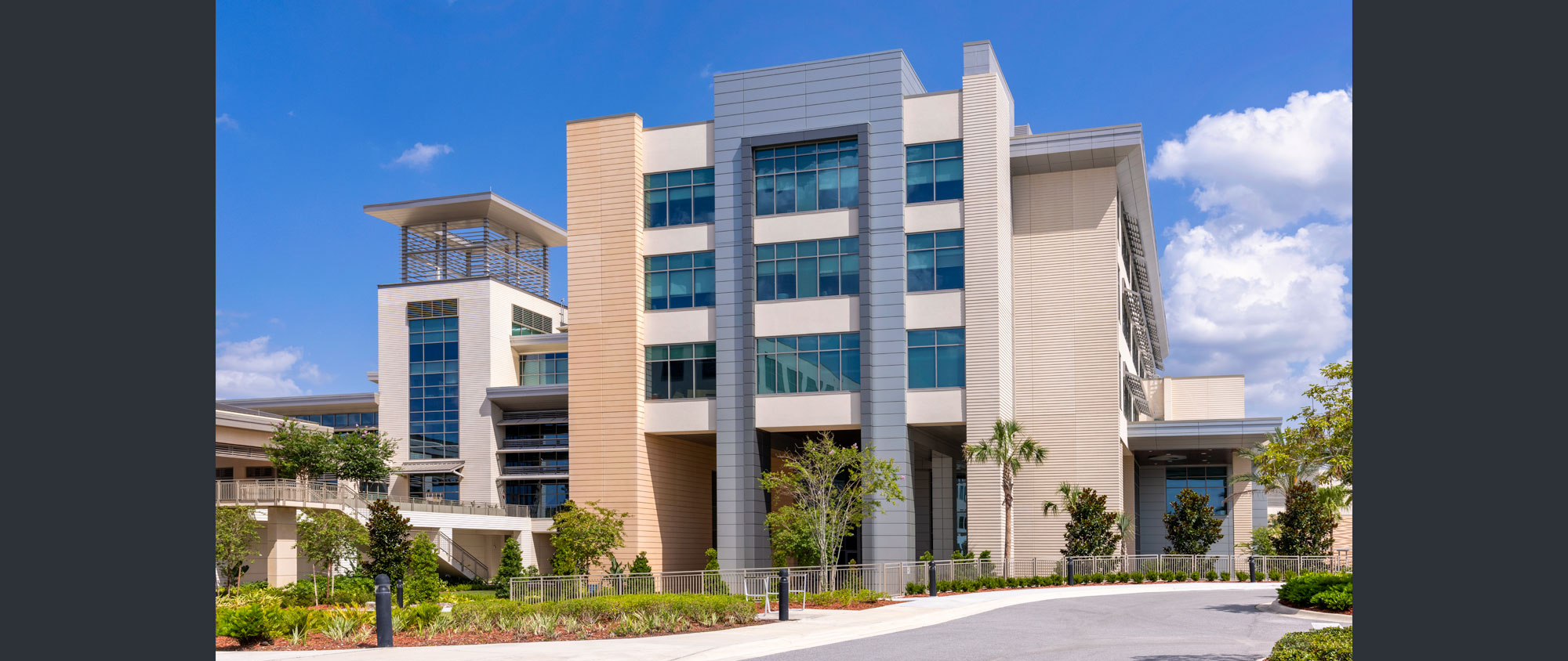
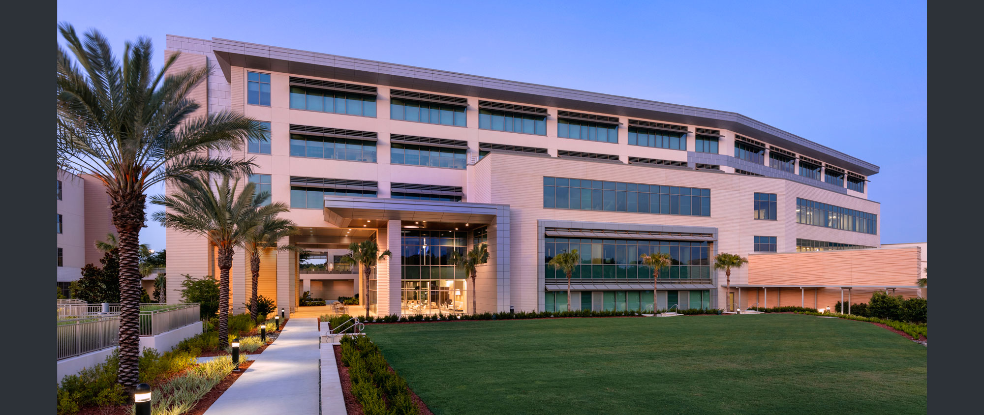
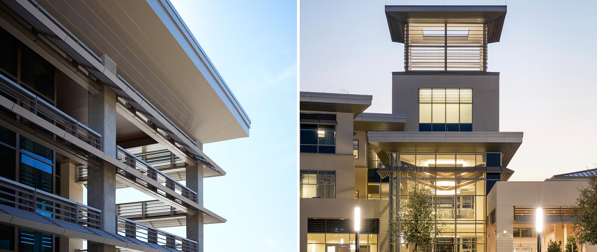
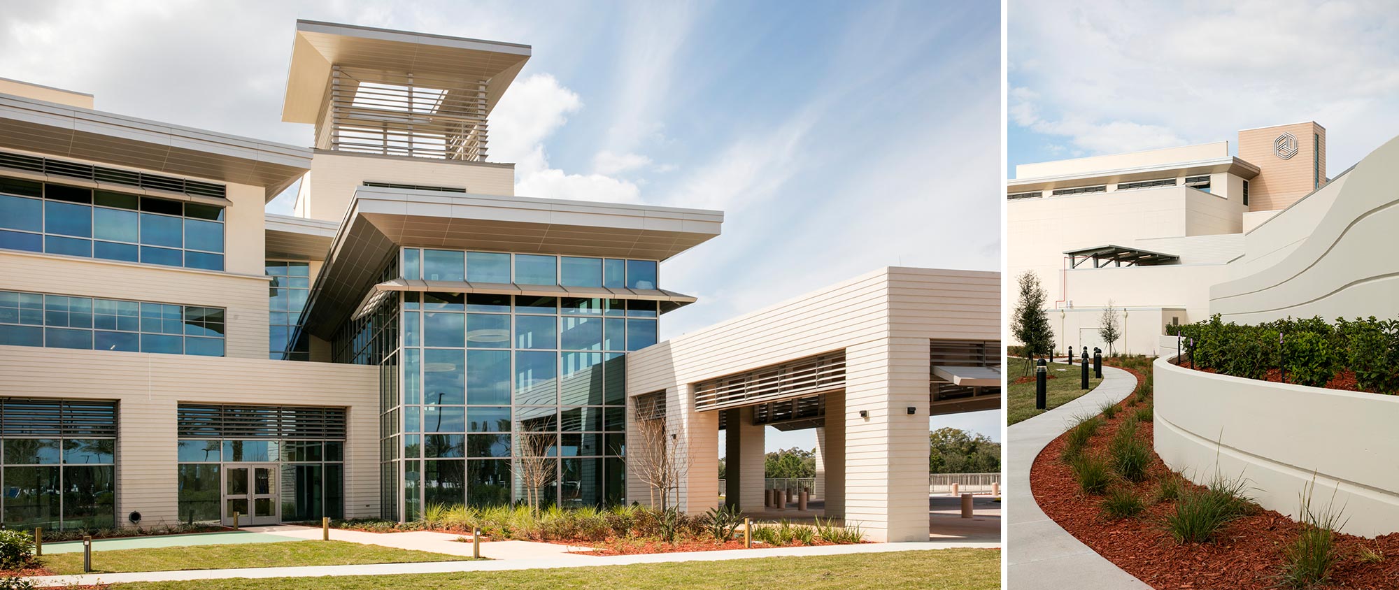
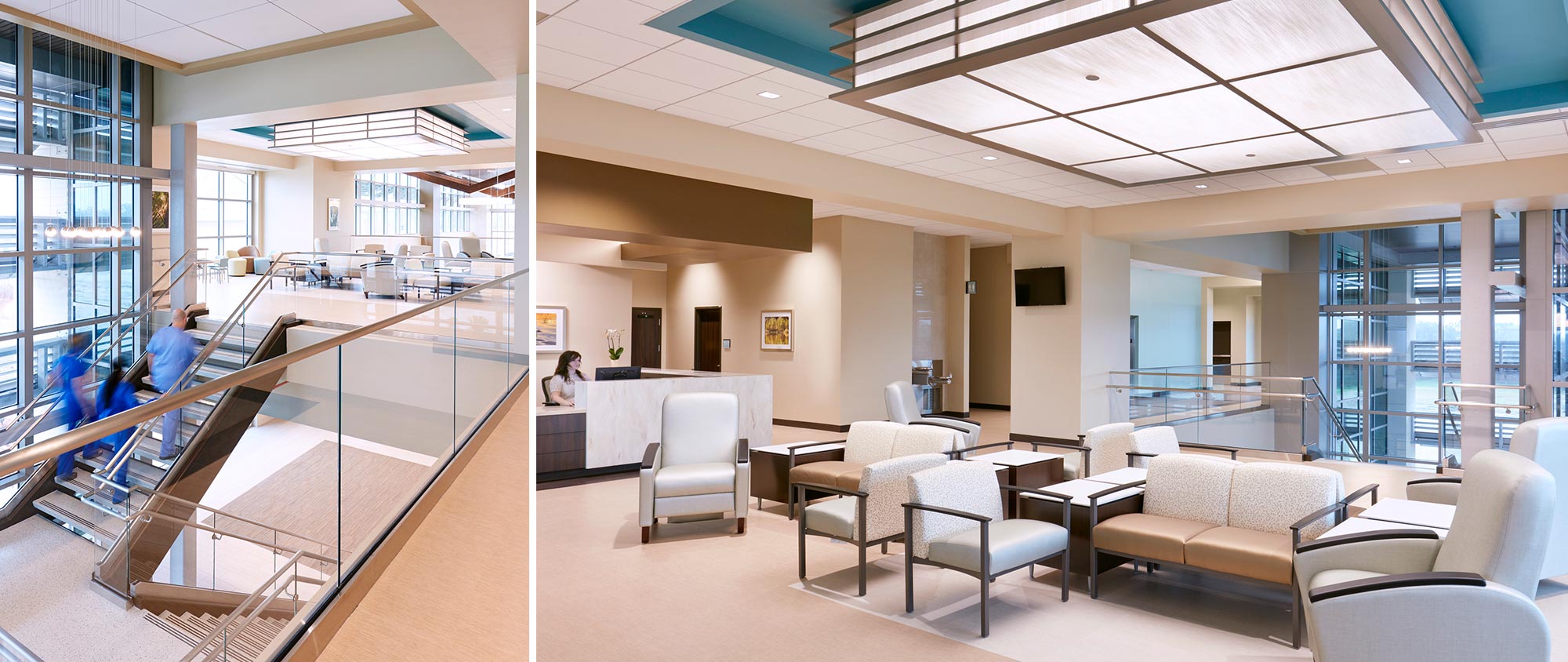
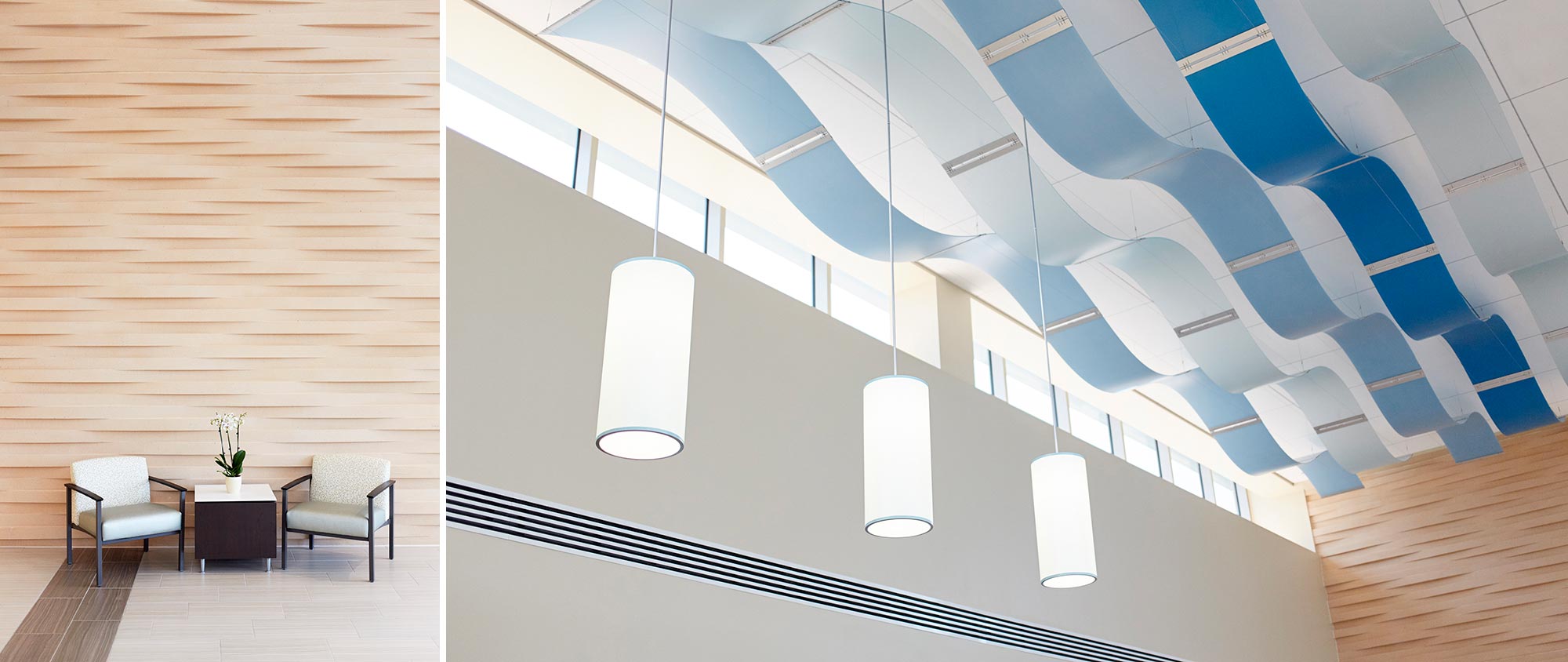
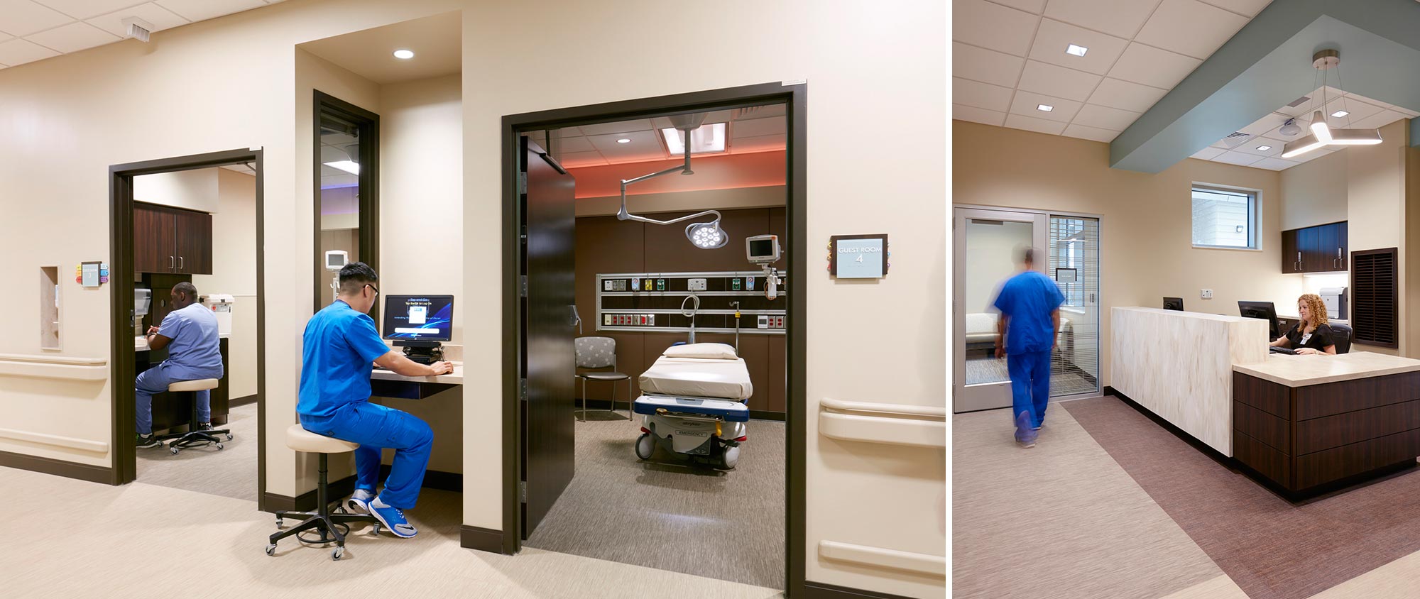
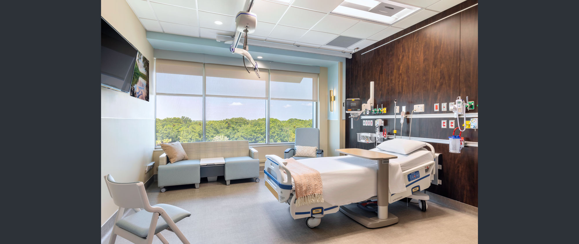
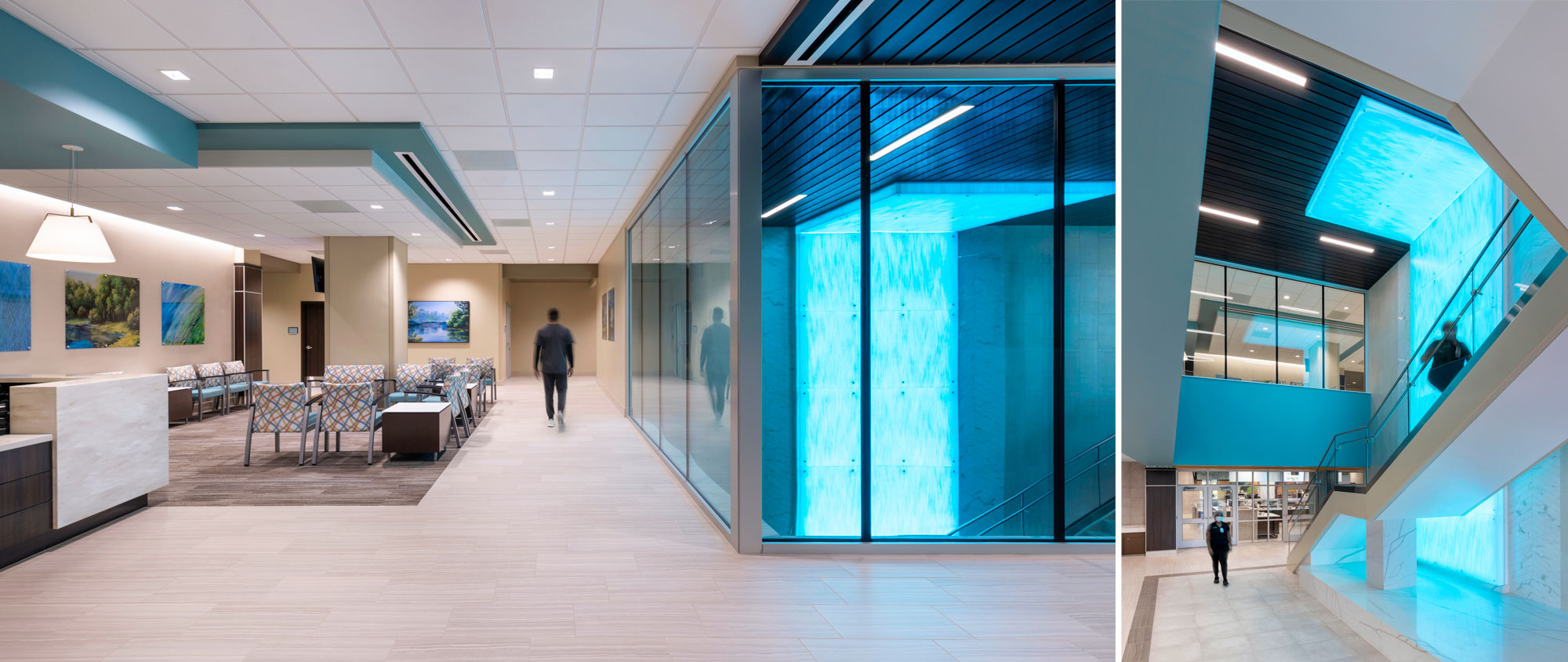
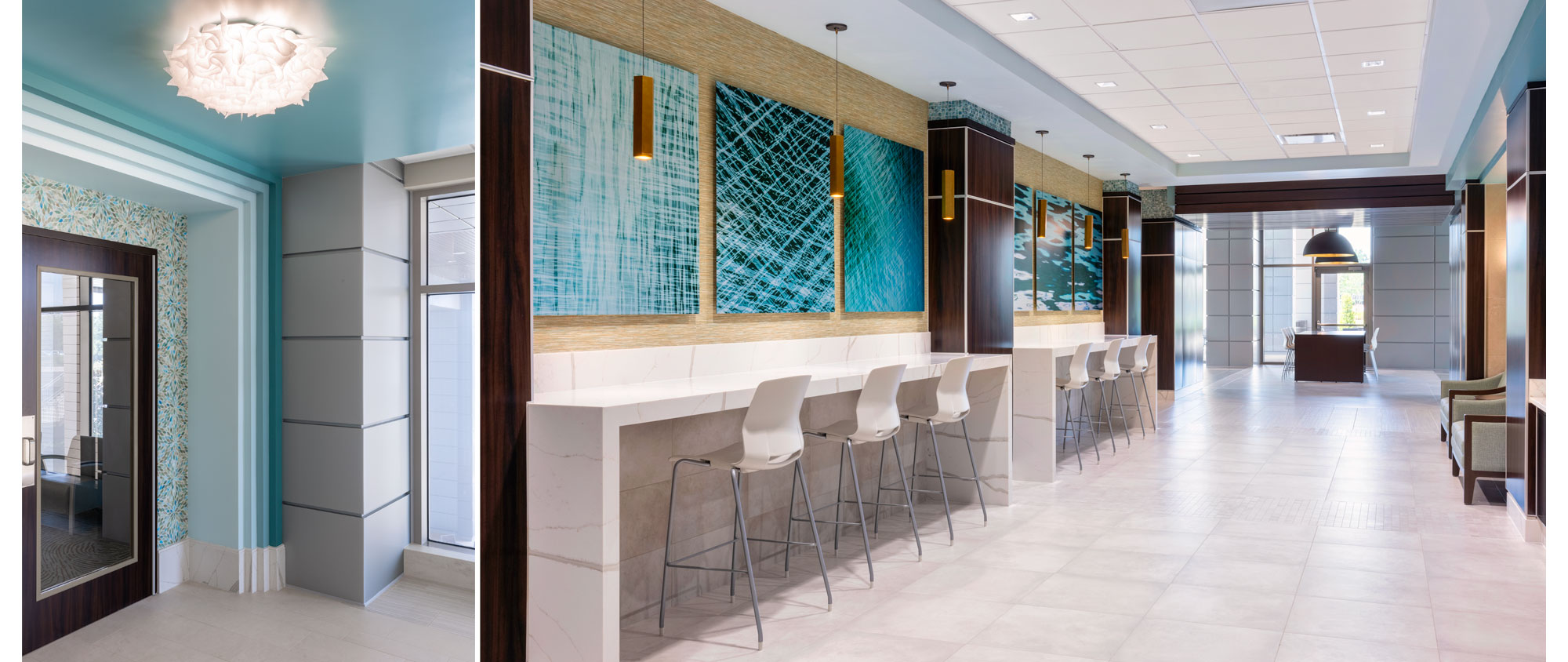
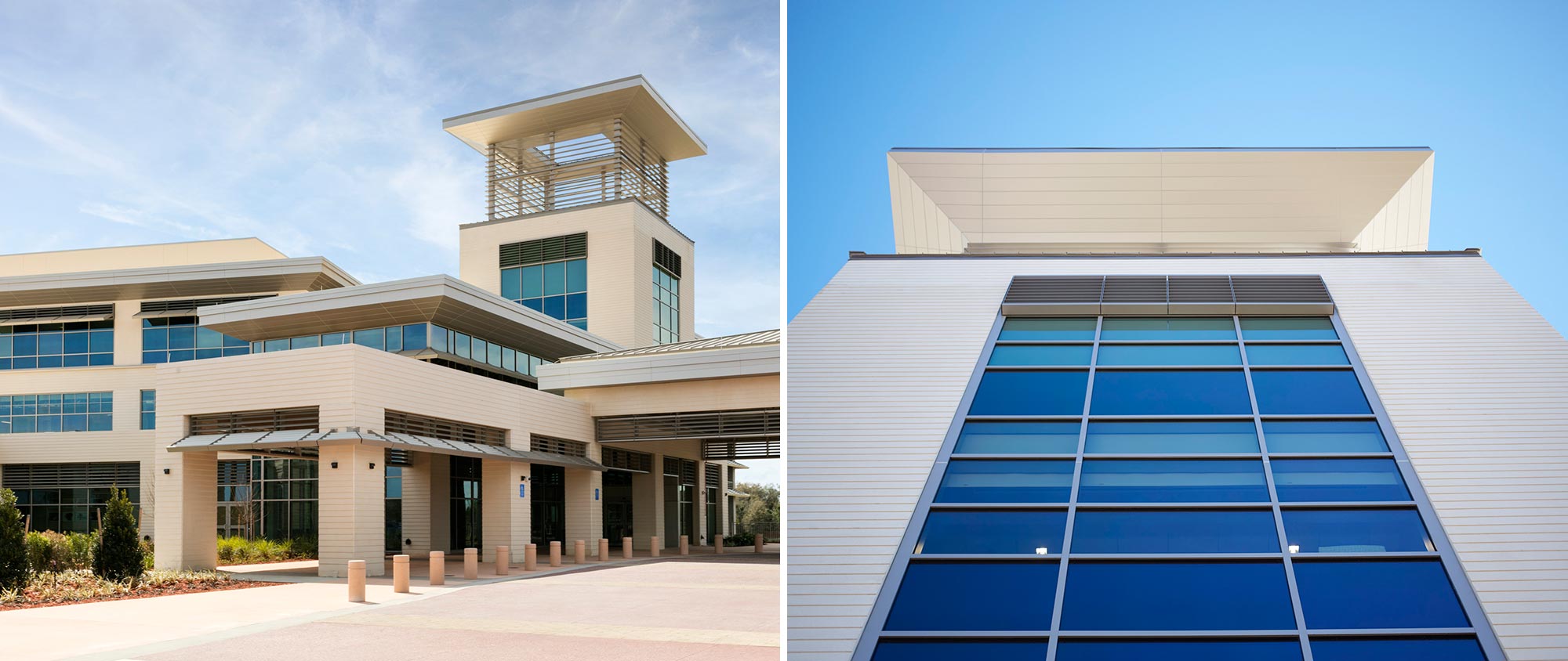
The patient tower is the second phase of this new health campus. It includes a five story, 202,000 sf bed tower expansion to accommodate 80 beds with capacity to expand vertically with up to 120 additional beds. The design was created with the “wellness vs illness” model in mind. The design of this new tower seamlessly blends with the existing freestanding emergency department and expands the existing imaging and surgery departments. This was achieved by establishing an overall ambience of more “hospitality” than “hospital” through regionally appropriate colors, unique lighting, and comfortable seating. A monumental stair connecting the first and second floors is illuminated by a custom resin light box, featuring color-changing LED technology to set a variety of moods.
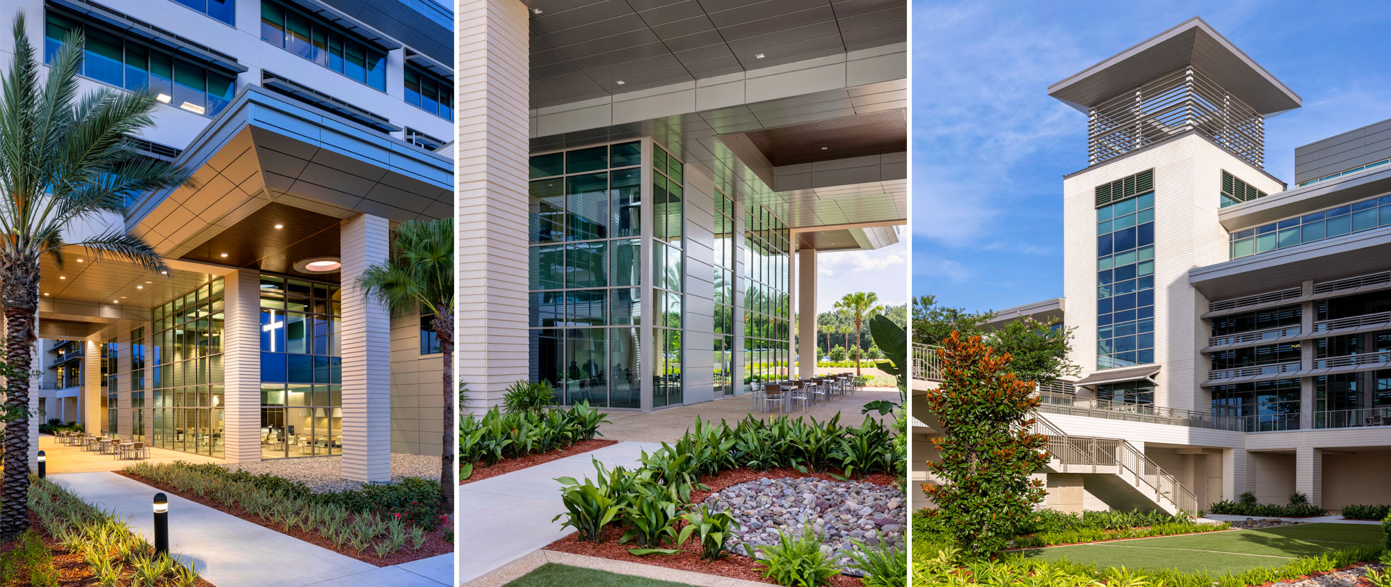
To take full advantage of the lush campus, the outside is brought inside through expansive glass curtainwalls and unobstructed traffic flow between the existing space and the new building. Interior elements, like the wood ceiling in the chapel and the dining area, are also incorporated into the exterior. This continuity of design further blurs the lines differentiating inside and outside spaces.
The project went on hold for 18 months due to CON (Certificate of Need) litigation with a local competitor. The scope changed dramatically during the design process, in an effort to respond to market conditions and changing needs. COVID presented challenges with securing materials, especially since existing finishes needed to be matched exactly.
This campus possesses an ambulatory focus and system thinking that utilizes the following principles: convenience, cost effectiveness, lean design, sustainability and integration of the clinical areas. Design includes plans for future expansion of the ED by allocating the space to be used in Phase I for observation beds adjacent to the ED. This approach allows for a rapid, cost-conscious future ED expansion. There will be two entrances, one for more emergent patients and the other for outpatients.
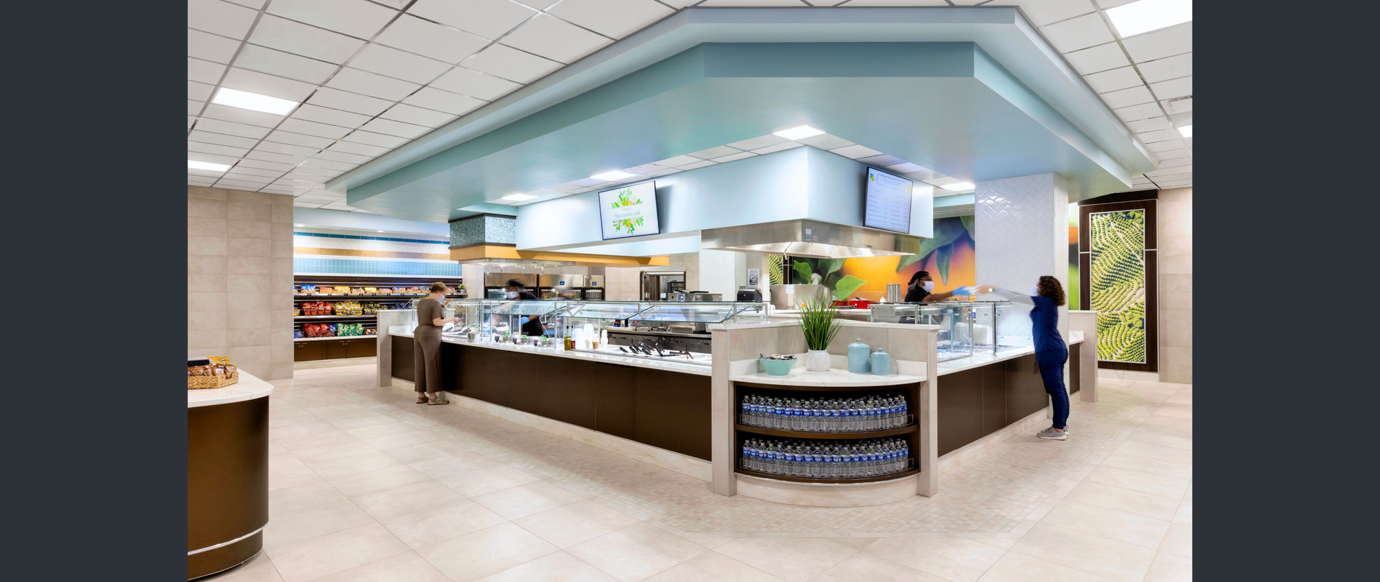
The master plan for the campus contains a “green spine” pedestrian link. This spine links the parking lot, the main entrance of the hospital and an outdoor healing garden for hospital staff, patients and the public. The hospital campus integrates into an adjacent, successful retail center to help make healthcare services more accessible to the community. The master plan also includes space for additional commercial and retail development, as well as outdoor space and a park-and-ride station for cyclists taking advantage of the hilly terrain of the adjacent areas as well as the nearby West Orange Trail. The hospital’s food service department will provide fresh, healthy menu options. Through these and other measures, AdventHealth is seeking to engage community use of the health and wellness campus.
Photos: © Attic Fire Photography
